Netscape Navigator 9 Beta 3 Released
Netscape Navigator 9 Beta 3 was just released, this version includes nice amount of changes and fixes. Here’s the changelog:
- New preferences in Tabs panel of Preferences dialog
- Added “Link Pad” to the “Clear Private Data” dialog
- Fixed issue with Link Pad icon blinking indefinitely
- Added News preferences to Netscape.com pane of Preferences dialog
- Fixed bug with feed processor that was causing both a memory leak and excessive CPU usage
- Added tab preference for opening bookmarks
- Added tab preference for links opened by Netscape.com integrated components
- Changed URL correction confirmation to be enabled by default
- Fixed bug in URL correction that was interrupting the auto-addition of “www” and “.com”
- Fixed bug that caused the “Confirm correcitons” item in the Location bar’s context menu to be hidden
- Added button in preferences to easily disable Netscape.com integration
- Various performance fixes
Google Browser, How Soon?
Seems Google wants to dominate everywhere and might join web browser wars someday.
There always been some rumors, but there is something going on for sure. Here are some facts:
Chris Silver Smith pointed that Google already registered GBrowser.com domain.
Ryan Naraine reported that Google hired a browser hacking guru.
They also have some deals with Firefox already and not so long time ago (April 2007) Michael Arrington wrote:
Maxthon Browser has sold a minority stake to Google. The total investment size is rumored to be around $1 million.
So… How soon and what can we expect from it?
Got Some Time? (Linux Users)
If you want to give away a few minutes of your time, there’s a nice poll which includes the following question:
Q: 3. Which web browsers do you frequently use on your Linux desktop(s)?
Opera 9.23 Final Released
Oh yes, this could mean that we will have something (maybe Opera 9.5) in the following Friday, or maybe not. OK, let’s go back to the topic.
Opera team just released Opera 9.23 Final. Here’s the changelog (since Opera 9.22):
- Fixed 4 crash bugs found using Mozilla’s jsfunfuzz tool.
- Fixed a stability issue with Speed Dial.
- Fixed a JavaScript security issue discovered with Mozilla’s jsfunfuzz tool.
- Scrolling problem with some Microsoft mice fixed on Windows Vista.
Since this is a final version, I strongly suggest you to upgrade your Opera browser to the latest, stable release.
Internet Explorer (IE) vs. Safari vs. Firefox vs. Opera
It’s about time for another article. I really like unusual things to do, so will try something different this time too. You probably read dozens of articles with the similar name. Yes, it’s “Internet Explorer (IE) vs. Safari vs. Firefox vs. Opera”. However, I am not interested in web browsers features, speed at this moment. No, I will compare those web browsers web pages design. That’s right, enough of those regular “Internet Explorer (IE) vs. Safari vs. Firefox vs. Opera” articles. It’s time to try something new.
“Internet Explorer (IE) vs. Safari vs. Firefox vs. Opera” – Web Design Battle
I will analyze every web browser main web page and see how does it looks, what is good or bad, see if it renders correctly in every web browser (using browsershots.org), etc.
Before starting to review web design itself, let’s see how well it’s coded. We will use validator.w3.org.
http://www.microsoft.com/windows/products/winfamily/ie/default.mspx – This page is not Valid (no Doctype found)! Failed validation, 209 Errors
Ouch.
http://en.www.mozilla.com/en/firefox/ – This Page Is Valid XHTML 1.0 Strict!
Good coding. No errors.
http://www.apple.com/safari/ – This page is not Valid HTML 4.01 Transitional! Failed validation, 3 Errors
Haven’t passed this test, but only 3 errors were found. Not bad.
http://www.opera.com – This Page Is Valid XHTML 1.0 Strict!
Good coding. No errors.
Now we will use browsershots.org to see if web pages are being rendered correctly in any web browser.
Internet Explorer – didn’t rendered correctly in a few web browsers.
Firefox – renders correctly in any web browser.
Safari – didn’t rendered correctly in a few web browsers.
Opera – renders correctly in any web browser.
Please note: rendering tests maybe be not accurate due rendering software.
OK, we’ve passed some regular tests, let’s review start pages web design now.
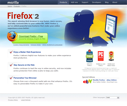
When you open web page for the first time, it gives you a very nice impression. Colors are very well organized; whole interface is not messed up with no need stuff. In the left there is very catchy “Download Firefox – Free” text/button so everyone will understand that this web browser is free. That’s a very good thing. Right after the text there is a version number, another great thing, helps you to know about the latest version and “Release Notes” tells you what’s new there.
Right after that, Firefox team presents some cool features, for example: “active protection”, “thousand useful add-ons”, etc. Although I think they should remove blue background from those red “check” markups, let’s go the right side now. We see awards, yet another great thing which can attract more potential users. In the footer I’ve also found a language selector, another plus. Now one more thing I didn’t like was their links system. “Download Firefox – Free” link is underlined which tells you that it’s a link, while links with text like “Enjoy a Better Web Experience” are more like promotional words than links, they are not underlined so you can’t say it’s a link (unless you mouse over on it). In the “Special Editions” corner there’s another different kind of link. This time when you mouse over, text become underlined. So there is like 3 different styles of linking which can confuse not experienced web surfers a bit.
Pros
- Catchy download button.
- Includes “FREE” in the start page.
- Version number included.
- Release notes.
- No validation errors.
- Site renders correctly in any web browser.
- Reasons to try Firefox.
- Possible to change language.
Cons
- Links system might be confusing to new web users.
Internet Explorer
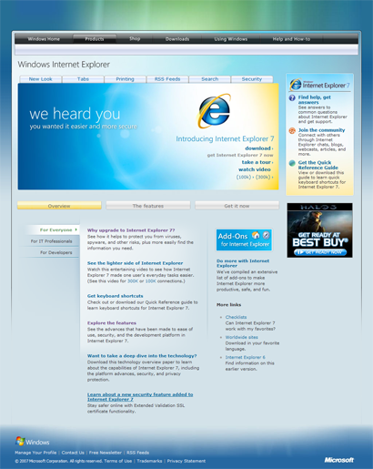
Although Internet Explorer start page contains so many errors, it does look nice. Actually, for me Internet Explorer page is more beautiful than any other web browser. It contains nice glassy buttons, some effects and well chosen colors. In a few words I would call it “Vista style”. Right after navigation there are some new features listed, for example: New Look, Tabs, Printing, etc. which gives you a nice impression of what you can expect from Internet Explorer browser. You can’t instantly find “download” button as it’s not really separated from whole content, that’s a bad thing. Links (in the picture) also needs some improvements, “download”, “take a tour” and “watch video” are same size, color, but only two of them are links. Yes, there is a small “arrow” which should tell you something, but I think that “watch video” shouldn’t look same as links because it’s not a link and it’s not a good idea to confuse site visitors. Right after promotional picture you can find a list of new features and reasons to try this browser. One more thing which I didn’t like was advertising in the right corner, that’s not professional.
Pros
- Good looking site.
- New features listed.
- Reasons to try Internet Explorer 7.
Cons
- Lots of validation errors.
- Doesn’t renders well in all web browsers.
- Links system might be confusing to new web users.
- Advertising in the right corner.
Safari
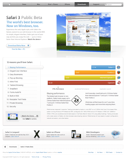
Right after I’ve opened this page, thought: grey… Grey color is dominating there, from top navigation to background. For me grey color is more like a depression color so I really don’t like Safari start page color scheme. However, not everything is bad here. Big screenshot instantly allows you to see how does Safari look and it’s pretty easy to notice “Download Beta Now” button too, although it’s not so catchy as Firefox one. If they could add a full version number, that would be great. Right after button you can find word “FREE”. Another great thing; before downloading users should know, whether this browser is free or not. What we see next is the top 12 reasons to try Safari, yet one more plus. I kind a like their way of showing those 12 reasons with some fading. Looks nice and doesn’t require new page loading. First reason is “Blazing Performance”, and here you go, we see performance graph. Of course, Safari is the winner there. Yes, that’s another big plus to Safari web design. This trick helps to convince users and try Safari 3 Beta.
Pros
- Reasons to try Safari.
- Includes “FREE” in the start page.
- Safari screenshot in the start page.
- Performance graphs.
- No new page loading required when viewing 12 reasons to try Safari.
Cons
- 3 validation errors.
- Grey (depressing color) dominates there.
Opera
OK, no offense, but for me this new design is the worst one. I used to like their previous tries, for example this one:
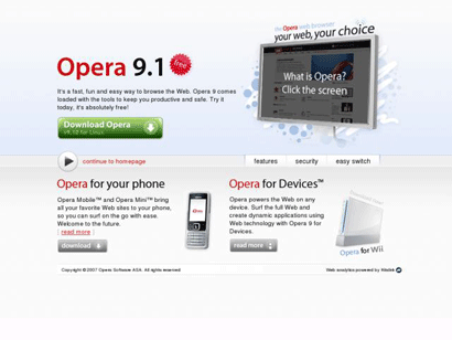
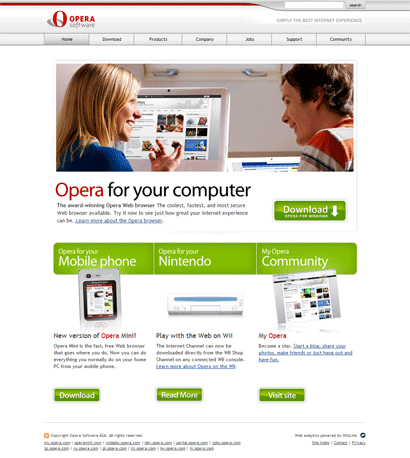
Not a perfect design (After Opera 9.2 it used to look even better), but much better than the current one. In the top I see old style grey buttons, not a good thing, it needs upgrade. After old navigation there’s a big picture, no idea why but it contains my.opera.com stuff and no browser screenshot, bad idea I would say. After that strange picture we see promotional text which says “The coolest, fastest, and most secure Web browser available”. Although that’s not a bad thing, but they should include some reasons why it’s so cool or so. In the right side we see green “Download” button. This button should include “FREE”, this is a MUST for Opera, click here to see why and that’s almost all, after download button we can find other “Opera Software” products promotions.
Pros
- No validation errors.
- Site renders correctly in any web browser.
Cons
- Old style navigation.
- No “reasons to try”.
- Only a few words of text.
- Where’s “FREE”?
Conclusion
If there would be a beauty contest, Internet Explorer start page would win, but it’s not all about beauty. Web design should render correctly in any web browser, contain most important information in the start page, have nice user friendly interface, etc. So… And the winner is… Firefox. It had no validation errors, nice interface, most important information listed, well chosen colors and much more. Regarding second place, probably that would be Safari, it had nice navigation and performance graph. Third goes Internet Explorer. I know, it’s cute design, but that’s not enough. And the last one… Opera. Start page needs serious improvements, maybe they will make a new design after Opera 9.5 is released, I don’t know.
Also, this is only my opinion.
EDIT: I’ve just rewrote my conclusion, Internet Explorer was in the second place due it’s beauty and third one – Safari. It’s really hard to decide.
What’s your favorite web design?
Like my posts? Subscribe.
EDIT2: Why those pages?
I have used Google Search and thought what would users type in order to find that web browser.
So it was like: Internet Explorer, Firefox, Safari, Opera. I took a first result (which most searchers clicks) and analyzed that page.
[digg-reddit-me]
Foxkeh From Japan
Meet Foxkeh. It’s a new toy which was born in Japan and was created to support Firefox promotional campaign.

Is it cute? Maybe. I find it kinda funny and friendly looking toy. Foxheh.com blog also says: “Could this go into mass production if there’s enough public demand?!” So it’s up to you I guess.
Also, take a look at this promotional banner. For me it looks much better than the standard ones.

Firefox 3 Got New Download Manager
Good afternoon everyone, first of all, sorry for not posting more than a day, my internet connection was down. But finally it’s fixed now. So let’s do the news.
One of the most interesting and great features in Firefox 3 was announced plug-ins “manager” (which rocks).
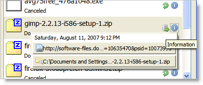
This time they are upgrading download manager. What’s new there? It became more user friendly. Now Firefox 3 download manager “separates” them by downloading stage, for example: active downloads are being shown in one line, while completed in another one (same with paused and canceled). When download is completed you can check it’s info by clicking small “Information” icon which shows download url and location in which it was saved, thought it would be great if I could see download url and location where it’s being download all the time (like Opera’s download manager).
New Firefox 3 download manager also includes a search bar and might get more upgrades soon.
More Great Stuff In Firefox 3
Firefox team keeps adding great features and last nightly build is not an exception.
What you can do now is see installed plug-ins in very friendly way, also enable or disable them, for example: Flash and/or DivX players.
Here how it looks:
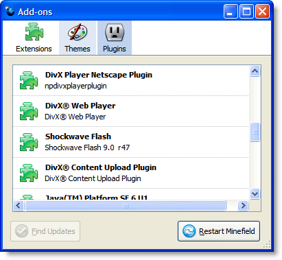
Picture source.
Using Firefox 2 you can type about:plugins (in the address bar) and get similar information but in not so friendly way. Actually, you will see more than a few lines of text. Seems Firefox teem playing trying to make Firefox 3 as friendly as possible.
Mozilla Store Re-Opens Next Week
Just some news about Mozilla store. It will be re-opened next week with brand new design, new items and other great stuff. Let’s wait and see what happens.

