Opera 10 New Skin is Here
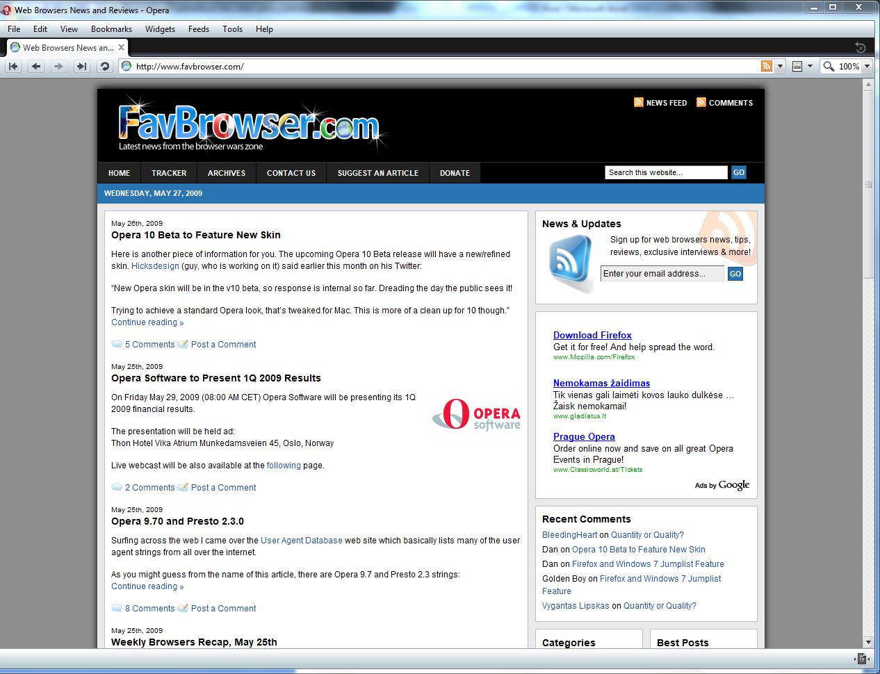
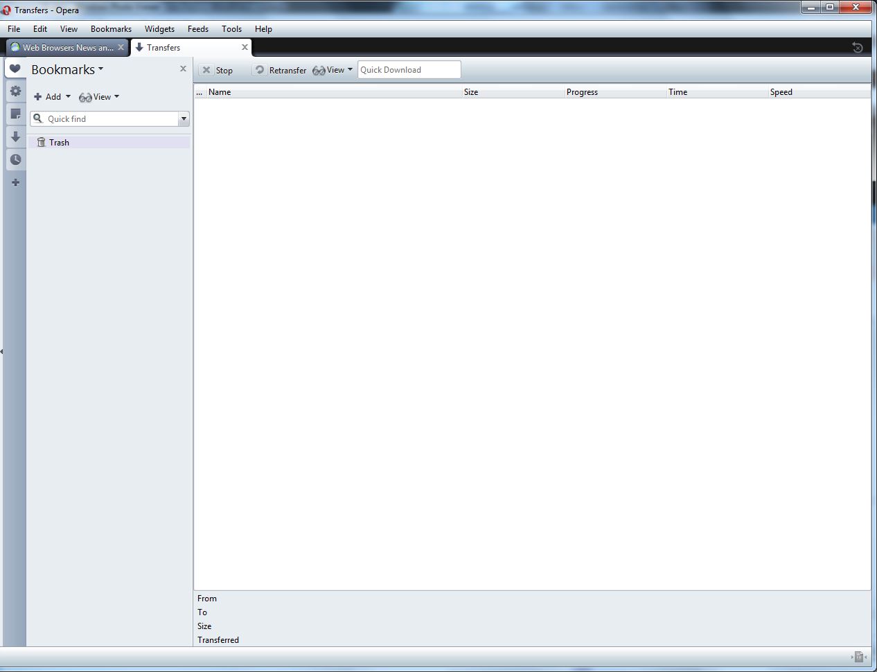
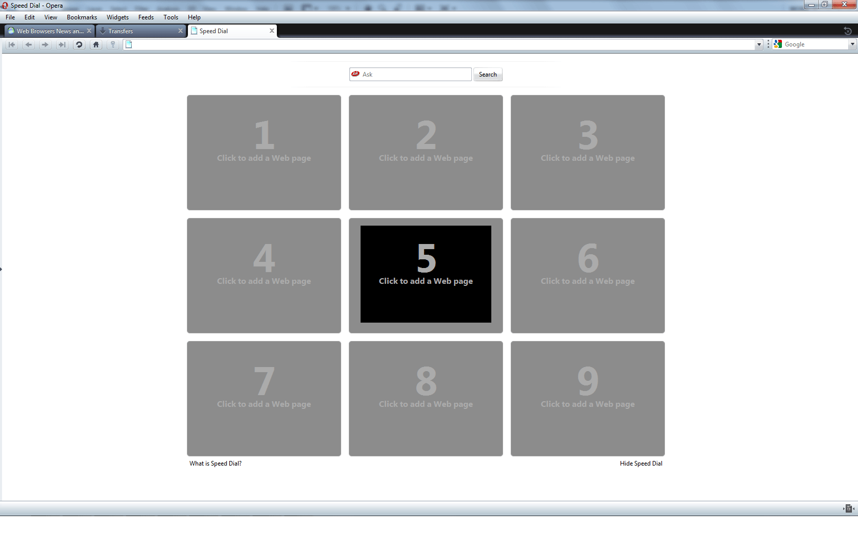
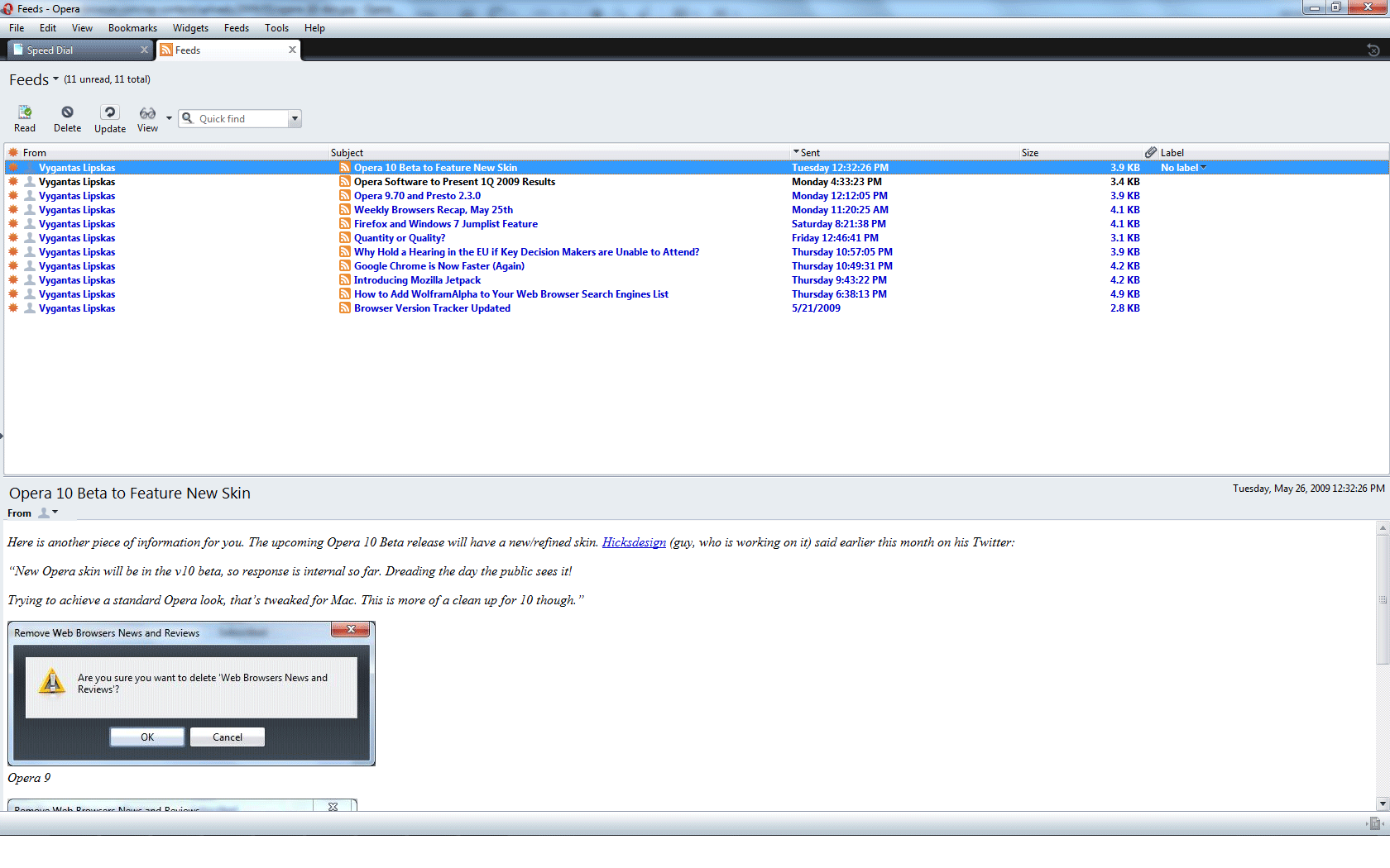
Today Opera Desktop Team has released a new weekly build (not a beta/alpha 2) which features new Opera 10 skin. Please note: this is not a final skin version, so don’t take it too seriously.
Few screenshots:
For more details, please visit the following post.
Overall, much better than the original one (expect for the speed dial and blank page icon), great job. Kind of reminds me Google Chrome though. What do you think?
Download
[digg-reddit-me]
About (Author Profile)
Vygantas is a former web designer whose projects are used by companies such as AMD, NVIDIA and departed Westood Studios. Being passionate about software, Vygantas began his journalism career back in 2007 when he founded FavBrowser.com. Having said that, he is also an adrenaline junkie who enjoys good books, fitness activities and Forex trading.


Ehh, I do not really like it. I want it to be shiny not plain. We’ll see later on.
It is much better than that ‘childish’ black thing they’ve released with ver 9.x
I hope that designer of the former default skin was fired.
Btw, still, the best Opera skin out there is Tango CL, but this one _ISN’T_ bad at all.
I like IBIS.
http://my.opera.com/community/customize/skins/info/?id=8655&rtype=skin
I think that’s why Mr. Hicks was hired, the person who made the old skin did a horrible job. :(
Just installed Tango on 9.6, it’s too gray for me.
o yeah, it looks good. it has lots of rough edges, but as a clear WIP it looks as it has that, what the old one missed – theme and a clear idea behind it. a nice one.
i have to say, that besides chrome ultra-simplicity, this one will be the best looking default skin.
btw. that Tango is good too, blends and dissapears (icons to 40%) definately better than 9.x default, and has a nice effect of being easy to ignore yet very clear when i look for something.
I’m using. *-*
SpeedDial screen is under development yet I guess.
It looks like the bastard child of Chrome and Safari for Mac. Not sure if I like it, but the part that irks me the most is that they won’t be removing the title bar any time soon by the looks of it. God that thing is hideous, and getting rid of it was one of the things Chrome did very, very right.
I still prefer old “8” skin in compact version, or BeOS skin.
I like the new skin alot but like Morghus said they should remove the title bar. In my opinion, the title bar is completely useless except for the three little buttons: Restore, minimize, and close.