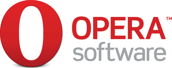
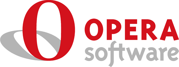
New Opera Software Logo
New

Old

One of the changes in Opera 10 was a new logo. Well, Opera Software has recently received a new one as well.
For different formats and sizes, head over to the official resources page.
[digg-reddit-me]
About (Author Profile)
Vygantas is a former web designer whose projects are used by companies such as AMD, NVIDIA and departed Westood Studios. Being passionate about software, Vygantas began his journalism career back in 2007 when he founded FavBrowser.com. Having said that, he is also an adrenaline junkie who enjoys good books, fitness activities and Forex trading.


I’d rather them continue with the old one, looks more professional for me.
But, oh well, I can’t change these things…
Much better than old one.
better, but they’ve should get rid of that shadow completely.
shadows + ovals = bad scalling, bad behaviour on various backgrounds.
it is much better than the old one, but still the best ‘new’ opera logo is that old WinGogi that theyve released by accident year+ ago.
Although I welcome to the new giant O, I think the new logo-type is absolutely horrible.
The old type had a very nice playfulness and warmth, while still staying professional. The new one is just cold and harsh.
Finally someone that agrees with me! *-*
it’s better becouse If we have more attention to new opera logo.”O”(with diferent character)in this new logo,like:
“O” is opera.
but, will be smoth(artistic)if have a shadow.
Far better than the old one.
The old slim O icon = impression of a lightweight browser.
The new fat O icon = impression of a bloated browser.
It’s better, the old logo had terrible letter kerning in “OPERA” word. But they should get rid of the shadows completely. And keep “ft” ligature from the old logotype.
The old fonts were far better. :/