Mozilla Plays with Firefox New Tab Page
 From MozillaLabs:
We’ve been iterating quickly over the last couple of weeks to define a potential new tab screen for Firefox.
We believe that the new tab screen should have two main functions: (A) To show you the sites you are most likely to be interested in going to, and (B) to not distract you. That’s the paradox: by design success is when the pages we show are maximally interesting/distracting, but an explicit goal is to not interrupt your flow.
This iteration focuses on solving that paradox by proposing a solution that we’ve dubbed “the cognitive shield”.
The Cognitive Shield
No matter where we put the links to your most visited sites (and their latest news), it always seemed to be a distraction, based upon our own perception and the feedback from thousands of testers. Given that the bulk of those testers are multi-tasking-adept early adopters, we’d expect that feedback to be even stronger from more mainstream users. Our original thought was to place the links along the bottom of the page — outside your foveal vision. In practice, the peripheral vision proved too strong, and the links still drew your eye and interrupted your cognitive flow.
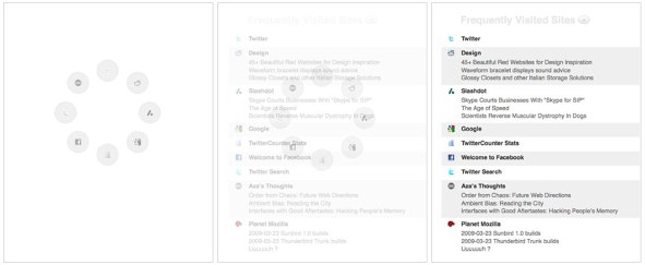
The cognitive shield hides the distractions until you move the mouse. Then the links fade in quickly.
Here’s the thinking:
If you are typing a destination into the navigation bar, then your locus of attention is on the place you are trying to go — so we should stay politely out of your cognitive way. On the other hand, if you are using the mouse than you will probably benefit from the mouse-based navigation aid, so show it.
Whether you are using the mouse is a good indicator of whether you are in a cognitive flow or not. That realization resolves the paradox: the links are there when you need then, and not when you don’t.
The Design
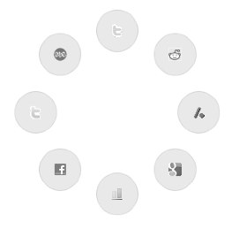
The design of the cognitive shield is a ring of 8 circles, each containing one of your top-visited sites. We think of it as a personal watermark.

We went through a number of metaphors for the cognitive shield. Instead of a metaphor which always strains — what symbol represents frequently used sites? — we went for an abstract glyph.
Testing the Prototype of New Tab
Step 1. Download and install the latest development build of Firefox 3.1.
Step 2. Download and install the latest version of the New Tab prototype.
Step 3. Let us know what you think, including what works, what doesn’t and how we can improve the design.
[digg-reddit-me]
About (Author Profile)
Vygantas is a former web designer whose projects are used by companies such as AMD, NVIDIA and departed Westood Studios. Being passionate about software, Vygantas began his journalism career back in 2007 when he founded FavBrowser.com. Having said that, he is also an adrenaline junkie who enjoys good books, fitness activities and Forex trading.


I tried it and it’s quirky. It’s nice that it’s there, and I’m sure a lot of people will find it interesting, but the ring doesn’t do anything at all. As soon as you move your mouse over ANYWHERE on the page, it doesn’t need to be over the ring, it will just turn into that list. It’s quite functional, sure, but if you don’t want it to break focus, how about making it semi-transparent or something?