Microsoft’s Spartan: A New Batch Of Screenshots Leak
 Small and blurry.
After yesterday’s leak from BGR, which as is now reported by some sources is fake (thank god for that), there are a couple of new screenshots that look much more legit, whether or not they are indeed real still remains a mystery.
And here they are:
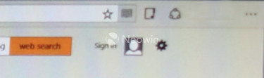
As you can see (a magnifying glass is recommended when viewing those), it looks pretty much like Chrome clone, which is a bit disappointing.
Still, better than yesterday’s train wreck, right?
[Via: Neowin]
About (Author Profile)
Vygantas is a former web designer whose projects are used by companies such as AMD, NVIDIA and departed Westood Studios. Being passionate about software, Vygantas began his journalism career back in 2007 when he founded FavBrowser.com. Having said that, he is also an adrenaline junkie who enjoys good books, fitness activities and Forex trading.
Subscribe
If you enjoyed this article, subscribe to receive more just like it.


Yeah a browser with tabs and address bar with common elements now equals Chrome clone.
This website really doesn’t have any interesting content anymore, I’m fed up I give up.
while I don’t agree with the last part of the comment, I fully agree about the “chrome clone” part.
I mean, a browser interface nowadays is basically a bunch of square rectangles for tabs, a long white rectangle for the address with a bunch of buttons around anyway…
That’s not right. There are plenty of simple design decisions that can be taken to ensure a browser is not yet another Chrome clone:
– have a dedicated search bar, like a proper browser
– don’t have the tabs on the title bar
– use the title bar for something else other than tabs
– have a status bar like a proper browser
– have colorful buttons (or at least buttons that aren’t simple black lines on a light gray backdrop)
And this is off the top of my head. I’m sure not everyone would like a browser with all these design decisions, but not everyone likes chrome and its clones either. I, for one, keep my Firefox as proper as possible. Tabs are not in the title bar, buttons are useful, there’s a status bar, etc, etc.
-not a must, I prefer keyword searches
-tabs on bottom? what would change? nothing, thats what
-such as…? yeah, even you don’t have suggestions
-the bottom half is not even in the screenshots, and besides it would still be wasted space
-LOL
and that’s even before seeing what’s the final products will look like and it’s degree of customization
As I said, not everyone will like a non-chrome-clone.
– a separate search bar is a must have for easy drag and drop search (i.e. keyboardless)
– I didn’t mean tabs on bottom, I mean using the title bar as it is used by every other application: a blank space that lets you drag the window around
– the titlebar is a good place to have the menu button, for example (which is where I have it). It is also a good place for additional buttons that won’t fit or go well in the toolbar or the status bar
– useful space is not wasted space. I don’t read or look at stuff that’s near the bottom of a web page, I always scroll down so I can read it at the top of my screen (because that’s where it’s easiest to read stuff, it’s basic anatomy). A status bar is the only place to display an hovered link (and DEFINITELY not on a popup like Chrome does) and status dialogs, and it’s perfect for any of the many buttons of common extensions such as adblock plus, no script, cookie safe, stylish, flashblock, etc, etc.
– you misspelled “I’m an idiot who can’t understand what ‘not everyone would like a browser with all these design decisions’ and is an idiot”
As for your last sentence, my English must be too poor (non-native speaker, sorry) because I can’t understand it.
If it’s a screenshot you want, here’s a screenshot for you.
http://s30.postimg.org/v0gn8fhq9/image.jpg
I hate Chrome an its clones.
I hate this trend that every browser is dumbing down its interface, limiting possibilities.
I want my tab bar to be at the bottom of the screen. Why ? Because it’s closer to the app bar. Better UX.
I want my menu bar. I don’t want a browser that’s need ten hops to attain an option.
I want my “http” in the url bar. Because I know what it means, and I know the difference with “https”, “ftp”, “magnet” etc.
I want a status bar. Because I want to know what’s going on.
I want to be able to customize not only the color of a button, but also where it is.
I want a browser that changes to fit me, and not the other way around, as every browser do now.
It will be light. It will be easy. It won’t be customizable as I would love to.
It will only be a new lack of choice.
This site used to have nice little insights and reviews, exclusive content, it even brought some interviews in the past…
Now it’s of no use for me following it if all I get this kind of shitty affirmations again and again, I stopped after this post and I’m only replying through DISQUS.
Most definitely better than yesterdays!
The design reminds me of this firefox theme:
https://addons.mozilla.org/en-US/firefox/addon/simplewhite/?src=ss