First Spartan Browser Screenshot (IE12 Replacement) Is Here
 Reminds us of something from the 90s.
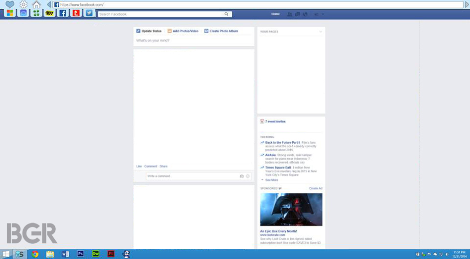
A new leak from BGR has brought us the very first screenshot of Microsoft’s new web browser codenamed Spartan. As you can see from the picture below, it is extremely minimalistic and ugly.
According to the report, in September Microsoft has assigned a dedicated team to work on Spartan and it has been doing so ever since. While details remain scarce, I is known that there were a total of three UI redesigns with last one being done in late December. The good news? This is the second and not the third version of the user interface, which leaves us some hope that it won’t look as atrocious as it does in the leaked screenshot.
What’s your take on the Spartan’s look?
[Via: BGR]
About (Author Profile)
Vygantas is a former web designer whose projects are used by companies such as AMD, NVIDIA and departed Westood Studios. Being passionate about software, Vygantas began his journalism career back in 2007 when he founded FavBrowser.com. Having said that, he is also an adrenaline junkie who enjoys good books, fitness activities and Forex trading.
Subscribe
If you enjoyed this article, subscribe to receive more just like it.


4chan is bookmarked? What?
Also, don’t UI designers at MS have any brains at all? I mean, after Metro and Windows 8 they must not have any, by the looks of their shonky work. But that forward button at the end of the location bar is idiotic by all regards. It makes no sense whatsoever.
It is just a pre-preview, I can be…worse in the final release.
Haha, that’s amazing! If this is real then I don’t know what they’re thinking.
Are they thinking to catch up with Chrome with this UI? Well, good luck Microsoft. This is pure ugly.
microsoft it sucks worst ie yet
I would like to think that they are working on rendering engine, standards compliance etc. at the moment. Chrome/UI will hopefully follow.
WTF
Microsoft???
The screenshot posted here is either fake or from a prototype version. The original UI has been posted on Neowin.
Why reinvent the wheel? No one wants ‘options, homepage and bookmark’ icons on the left. Btw where’s the ‘X’ button, please tell me it’s not hidden under options.
And are those in the left side second row -tabs-? I don’t want to hunt tiny squares to switch between tabs.