Meet Firefox’s New Logo
 Shadows will remain.
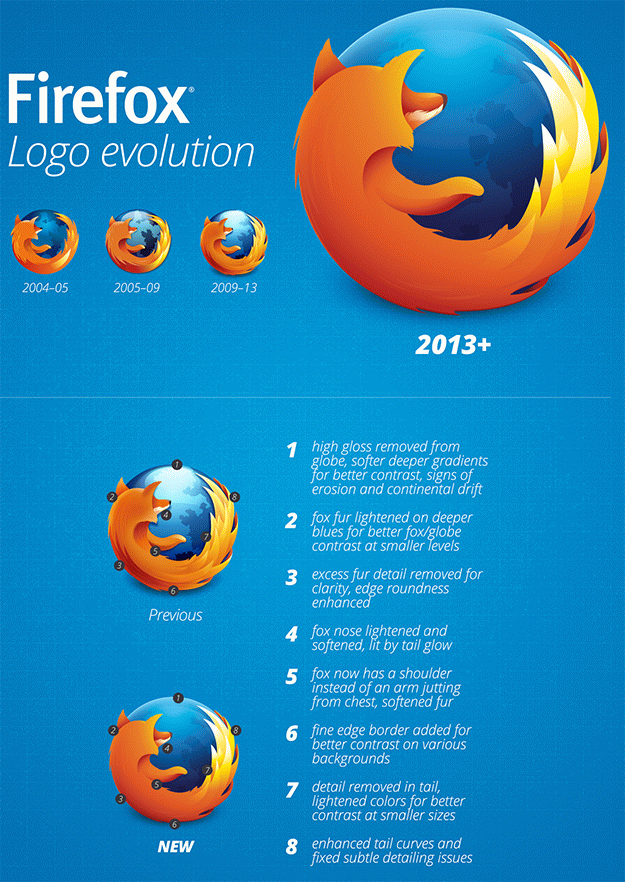
Now here is something uneventful yet still very worth mentioning: a new Firefox logo, which was designed with mobile in mind.
How so? According to Mozilla, it was optimized to look crisper and cleaner on devices with small screens yet would still scale really well on high resolution displays (such as qHD resolution Windows 8.1 ultrabooks and tablets).
What do you guys think?
[Via: Seanmartell]
About (Author Profile)
Vygantas is a former web designer whose projects are used by companies such as AMD, NVIDIA and departed Westood Studios. Being passionate about software, Vygantas began his journalism career back in 2007 when he founded FavBrowser.com. Having said that, he is also an adrenaline junkie who enjoys good books, fitness activities and Forex trading.
Subscribe
If you enjoyed this article, subscribe to receive more just like it.


Although it is not my preferred browser, it had been the browser with the best logo. And now it is even better. Congratulations, John Hicks for designing such great icon, an they also go to the people that redesigned it to be now the new one.
It’s much better, but they should have taken away the shadow, too, and deleted the blue holes in the tail.