A Pleasant Opera.com Design Change
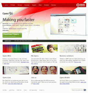
 With the recent my.opera.com change, Opera home page was redesigned as well. Old design was really bad and had old looking components, such as menu for example.
However, this one looks much better. Fresh and light. Dark red color navigation, black pop-up menus, latest news section and more.
There are two things which could be changed though.
1. Where is “FREE”?
2. Opera Mobile should be somewhere near Opera Mini but not in the bottom corner (like least important thing).
Overall, it’s a pleasant improvement. What do you think about it?
About (Author Profile)
Vygantas is a former web designer whose projects are used by companies such as AMD, NVIDIA and departed Westood Studios. Being passionate about software, Vygantas began his journalism career back in 2007 when he founded FavBrowser.com. Having said that, he is also an adrenaline junkie who enjoys good books, fitness activities and Forex trading.


Even though I’m a diehard Opera fan, I have to admit it’s quite nice but still not good enough..
Opera 10 will have most improvements we search.
@Andrew Wox
Says who?
wut now already opera 10 alpha available.
100% acid 3 test,30% faster than before,tell me i wasn’t wrong before.
User interface will improve in beta edition available if I’m right before 2009.I think you are firefox fan but at the end of the day(May be year) LOYAL OPERA users will win.HA HA HA HA
DREAM FIREFOX DREAM YOU CANNOT WIN