Sexy Improvements Coming To The Opera UI
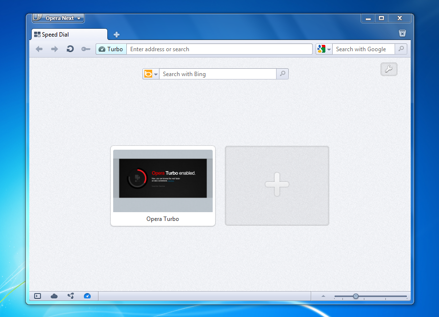
Windows Screenshot
Opera Software has revealed the first phase of Project Featherweight. What this project entails is to make Opera as user friendly, bright, and light as possible whilst not sacrificing flexibility or power.
We want the user interface to match the speed of our rendering engine. – Jan Henrik Helmers from Opera User Experience and Graphics (UxG)
Featherweight has been kept a secret up until now so that it may be presented as a comprehensive solution as opposed to bits and pieces being shown at a time. Changes such as those to the address bar and the status bar are quite visible, but the whole skin was reworked and this includes a brand new icon set. Going by Opera, this is the first step in project Featherweight, and a significant collaborative effort between the Desktop and UxG teams.
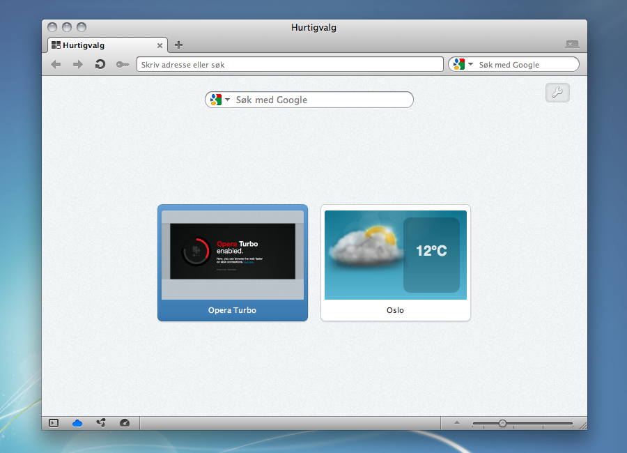
Mac OS X Screenshot
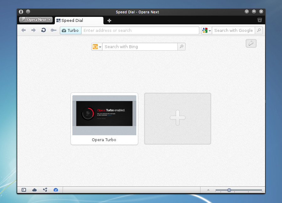
Unix Screenshot
About (Author Profile)
Being passionate about software, Armin joined FavBrowser.com in early 2011 and has been actively writing ever since. Having accepted the challenge, he also enjoys watching anime, indulging in good books, staying fit and healthy, and trying new things.
Subscribe
If you enjoyed this article, subscribe to receive more just like it.


Comments (31)
Trackback URL | Comments RSS Feed
Sites That Link to this Post
- Opera überarbeitet die Benutzeroberfläche « Browser Fuchs | June 22, 2011
I am a fan of Opera but i don’t think that new default skin deserves so much attention. Opera have best customizing options of all browser but thay failed to market them and make enough hype. Skin/layout contest is what we need :D
On Un*xes the new skin is ugly.
Look at this comment:
http://my.opera.com/desktopteam/blog/2011/06/22/featherweight?startidx=300#comment63576472
The guy has dismembered his install. As If someone uses a browser like that. That setup will look horrible in any OS
Yes, maybe you are right. But as I can see, that post is deleted.
this is opera ‘customization’ :)
“you can do EVERYTHING with our browser, but DONT – it will make our browser look ugly as we no longer support these options”
wow it is a chrome MK II :)
with the exception of chrome being MUCH better in space management – almost entire area between opera top edge and top edge of tab bar is wasted. screen real estate is cheap, eh?
and that trash can icon – it does not fit. it is completely out of place, out of placement and from entirely different iconset
oh – that ‘tank’ icon in the lower left – i know it is a ‘cloud’ but please, make it look less than Panzerkampfwagen 38(t)
opera looks never really were a problem (except for that IDIOTIC student-level black design around ver 9) – problem is no website compatibility, idiotic development focus (last 3 or so months is all about speeddial – sorry, speeddial is extension-worthy concept, that took firefox extension maker just 2 days to make it better than opera invention) and pathetic end-user relations/marketing. it is similar to RIM – both companies really dont understand end user and hope that they can make it only doing business with other companies. oh, and I love opera options screen – 5 tabs, with 95% options in the ‘advanced’ – who of you EVER changed anything on former 4 tabs?
Opera – obscurity by mediocrity..
I still dont understand your intentions. Why do you keep bashing Opera? They are an awful company, why are you waisting your time writing everything all over again? Why are you so possessed by Opera? Did someone beat you with Opera icon till you bled?
because i like when this ticks off opera employees, especially ones with 10 years under their belt that recently became prestigious Blog Comments Managers (ie. petty censors) and they are pissed off that they cannot delete comments here.
Opera – PR by censorship..
He applied for a job at Opera, but he wasn’t found to be competent. Ever since that happened, he has been bashing Opera day and night. He’s living on a welfare check because he can’t get a job, and he blames Opera for some reason.
The space at the top is optional. It only happens when not maximized by default, but can be changed so that it never happens.
Other than that I agree on some of your remarks. The preferences UI needs improvement. Some settings are _very_ hard to find and unclear (what’s “reuse current tab” supposed to mean? – write it so that people will understand that context menu searching will happen in the same tab).
In the last few versions they started focusing on casual users too much (from widgets to torrents etc.). They should’ve taken a more minimalistic but polished approach, IMO. Building a solid base of “power” users, which is ultimately the biggest target audience of Opera. Casual users will just take whatever is most advertised and Opera can’t compete there.
How is chrome better in space management when their tabs are non symetrical aka wasting space all the time?
Oh, boo hoo. Cry more.
Remember this is only the 1st phase of changing he interface
we will see huge changes in the interface in the upcoming days and when reaching 11.50 final
Just be ready.
I am glad that Opera is finally focusing on making things user friendly and light. Reaching the masses is key. The more knowledgeable users can still customize whatever they wish to customize to their liking, but making the default set up as easy to use as possible is mandatory.
Opera != Chrome – Since when has Chrome had a combined menu?
And Firefox copied Opera on the menu design. Opera 10.5 had it first and then FF4 copied it.
I do think the icons on the toolbar seem a little small on larger resolutions but since this only the first stage of the skin changes I won’t judge it too much.
Most annoying thing is FF users say they done it first.
Well Opera will help less fortunate browsers like FF.
FF you are welcome :)).
Opera copied it from Microsoft
Err… what?
FINALLY. They are finally paying attention to simplicity / Dumbing down.
But I’m all for dumb.
I thought Opera was pretty clean already but the new UI updates have blown me away. I can’t wait to see what further improvements they release.
I thought Opera was pretty clean already but the new UI updates have blown me away. I can’t wait to see what further improvements they release.
Why hasn’t this build been updated to Opera Next yet? This piece was written on the 22nd of June and checking for updates via Opera Next on the 23rd of June still doesn’t return any update prompts. The current Opera Next build is 1049 but 1054 and 1065 have been released since.
Disappointing there playing it safe ..Opera dont you know the URL bar needs to go?
No. Just no.
Hang on. IE’s implementation is not bad.
You can change search engines.
That’s all you need IMO.
*Sarcasm Fail*
Way too much padding on the buttons (horizontal and vertical) and the address bar itself (vertical padding). Lot’s of space wasted on my netbook screen. I’m disappointed.
Not a fan of the new design give me clean & crisp any day over soft & woolly , still Opera usually presents a new feature that’s half baked pops it back into the oven & when it’s cooked properly usually wins me over.
We have to wait for some new skins before we can judge I have only used the Opera default skin for a minute on initial download it’s the first thing I change
My new tab button is on the address bar along with the back, forward, refresh/stop, and bookmarks buttons. The new tab button is the only white button. D: