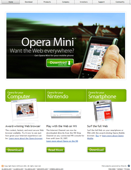
Opera.com – New Design. Do You Like It?
Opera Software updated their web page with a new design.

What do you think about it?
I prefer old version, even it needs some improvements and navigation.

They are giving too much attention to Opera Mini (which already got it), while their Desktop version is somewhere “outside”. If they would cancel Opera Desktop Browser development, this design would be good, but now… I don’t know… Silver navigation doesn’t (which looks very old) fit with that (too big) Opera Mini promotional image. While 1028*768 and lower resolution users don’t see anything about their Desktop versio at all (without scrolling). I think that’s a bad move and design should be changed.
About (Author Profile)
Vygantas is a former web designer whose projects are used by companies such as AMD, NVIDIA and departed Westood Studios. Being passionate about software, Vygantas began his journalism career back in 2007 when he founded FavBrowser.com. Having said that, he is also an adrenaline junkie who enjoys good books, fitness activities and Forex trading.


