Opera Refreshes “About” Page Looks, Adds New Icon
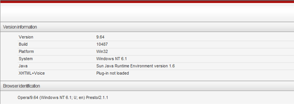
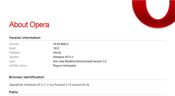
The upcoming Opera 10 Final release will feature a refreshed opera:about page which will replace gray and dull looking one.
Old

New

These tiny improvements are what make your web browser feel special.
Also, Daniel Hendrycks noticed a new icon in Opera/styles/images directory.

About (Author Profile)
Vygantas is a former web designer whose projects are used by companies such as AMD, NVIDIA and departed Westood Studios. Being passionate about software, Vygantas began his journalism career back in 2007 when he founded FavBrowser.com. Having said that, he is also an adrenaline junkie who enjoys good books, fitness activities and Forex trading.


A glimpse of the new NEEDED Icon.
I think they should rethink their icon. Why an O? Firefox doesn’t have an F for its Icon. Safari doesn’t have an S for its icon. Everytime I see that icon on my desktop I think of Overstock.com not Opera. lol
the big red “O” icon was great for everything, especially when it comes to 16×16 pixel icon (like on quick launch) and it scalable too (great for printing media), the question is why it always red? is it refer to the red carpet or the red curtain we usually see in opera?
The colour red symbolises many meanings in different cultures.
Opera is the red wine of Web browsing.
So it’s a disgusting browser then, or a fool who thinks he’s refined?
Via: http://en.wikipedia.org/wiki/Red#cite_ref-28
So it basically went something like this when the color were chosen:
(I hope it’s obvious that I’m bored… :P)
You should go whine about Google’s logo. There’s a lot of lame stuff you can write about it.
Maybe you haven’t noticed, but the topic here is “Opera […] New Icon”
Anyway, as for Google’s logo. Shadows look consistent, there’s a soft glass effect with the text slightly “outset”. Lastly, and most importantly, it’s stealthy and doesn’t distract the eye from the content.
Yeah, this is extremely “stealthy”:
http://www.hotmobile.org/2008/uploads/images/google_logo.jpg
LOL.
It is stealthy in that it’s not distracting from the surrounding elements (while also being pleasant to look at if one would like to do so).
I’m not really sure what you’re trying to show me with that picture either… it’s the same logo as on Google Search.
I was completely sure most opera houses I have seen had some white-brown-yellow form of color for its curtains, but Google Image Search says red so…
Anyway, found this when looking which might be interesting for some:
http://nontroppo.org/test/Op7/Opera-logo-critique.png
Looks like they are doing the same mistake again, what with that odd tubular look. It looks like a coin that’s been bent.
How are they making the same mistake again exactly? Are you an expert or something?
Although not as much, it still looks like some halfway try at being an “Escher look-alike”.
“expert” have so many crappy definitions available, it’s practically worthless to use it as anything but a marketing stunt. I really hate it when these types of people try to censor society with such remarks too.
The ‘O’ graphic is found in one of the CSS files inside Opera:
in body
background: #fff url(images/Opera_256x256.png) no-repeat 110% -120px;
Vote for which possible Opera Icon you like best.
http://my.opera.com/community/forums/topic.dml?id=283013
Nice initiative I must say. I seriously don’t understand why they can’t do something like what Alex Faaborg did regarding the Firefox icon and are planning to do with the Thunderbird icon.
I would vote for number five or two, can’t really understand people who voted for number four…
http://img21.imageshack.us/img21/2121/56904529.png
This time the suspected icon looks less rounded and prettier.
http://bit.ly/owRkO
It is less circular now and prettier.