Opera 9.5 New Skin Review
Earlier today Opera Software introduced their new default skin for the upcoming Opera 9.5 release. It is dark, got some shiny and glassy effects, kind of Windows Vista style, though bit too light for that. In case you haven’t seen it yet, check the screenshot below. OK, checked? Let’s start the review now, shall we?
Click on the picture to enlarge.
Installation…
Not much to say there, it just looks better than the previous ones…
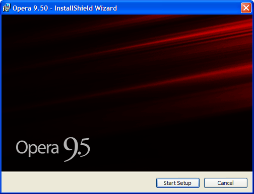
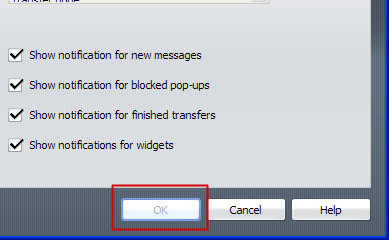
Reminder that it’s a beta?
OK, all finished. Let’s begin.
If I were a newbie, would probably say that this button is a print screen replacement. It just looks like a print screen button and says nothing about it’s real function.
Someone should change it. If you would click “Closed” tabs button, it will look like this:

It just doesn’t fit the current interface. Don’t you think so? Bad color + square…
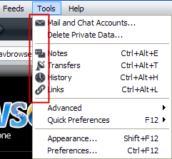
Menu icons are way too dark, looks pretty much the same, are not attractive and confusing
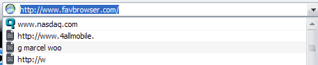
Now not sure if this is a skin related bug, but Opera cuts half of the text when viewing previous visited pages:
Here is probably one of the worst skin bugs. As you can see, it has a little X in the top right corner
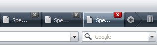
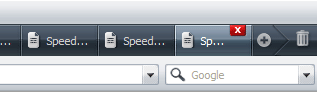
There’s nothing wrong with that. But what happens when you open one more tab? They disappear. This is a feature (same as in Opera 9), maybe limit should be increased a bit? There is still a plenty of space for the X button.
By clicking a small icon in the left corner, you can open panels (bug: when opening them via menu, scrollbar in the bottom appears) which look like this:
Icons issue again, there are no colors, looks the same… I hope they are not experiencing any kind of depression and decided to remove colors for some other reasons. Star could be yellow, little gear blue, etc. There should be some colors so users would find the one they want faster.
Buttons on click effect is burning eyes a bit and should be changed.
Maybe I am nagging too much, but tabs icon looks like an iPhone
One more icons problem. All are the same, makes it hard to find the one user wants. Forced to read all that text.

Just a small tip here: make the following button removable. CTRL+T works fine here.
If you have decided to remove top left icon before the tabs, it will look something like this:

Bit too close, 2-5px spacing would make a difference.
Status bar now has a small gradient, it actually makes the text bit harder to read. Not a big issue.
Same icons problem here:
And finally, transfers bar. Blue progress bar doesn’t match this color scheme anymore and on click effect is kind of odd.
Conclusion?
As for now, previous skin looks much better. Tabs color is too dark compared to the whole interface, (would actually prefer even darker tabs panel background if interface would match it) loaded sites text on tabs are blue (hard to read) and the issues mentioned above. I like their new style though.
7/10
Hope Opera team will also read this, improve their skin design, give me some credit or reveal a “top secret” Opera 10 feature so I can write about it here :-)
What’s your verdict?
Update:
So I went to my mom’s house (really new pc user) and installed Opera 9.5 there. Her first reaction was something like: “huh, what’s that?” After a little explanation she began using it… Instead of opening a new tab, mom typed an address on the same one. Why? Because she couldn’t find anything in the left corner (where new tab icon always was). Had to show tiny plus button in the right.
Now not sure if this has anything to do with the sight, but she haven’t noticed close tabs icon as well (old one was big and this one is very tiny).
As requested, I’m now installing Opera 9.27 there…
About (Author Profile)
Vygantas is a former web designer whose projects are used by companies such as AMD, NVIDIA and departed Westood Studios. Being passionate about software, Vygantas began his journalism career back in 2007 when he founded FavBrowser.com. Having said that, he is also an adrenaline junkie who enjoys good books, fitness activities and Forex trading.
Subscribe
If you enjoyed this article, subscribe to receive more just like it.


Comments (37)
Trackback URL | Comments RSS Feed
Sites That Link to this Post
- Opera 9.5 New Skin (Small Experiment) | June 7, 2008
- Opera 9.5 e la fabbrica delle meraviglie | Insel der Engel' | June 11, 2008
- Say NO ! | June 12, 2008
“But what happens when you open one more tab? They disappear!”
It’s not a bug — it’s a feature.
If you have opened too many tabs, “close” button will then appear only on current tab.
“Maybe I am nagging too much, but tabs icon looks like an iPhone”
Same here. :) That was my first thought too.
Limit should be raised a bit.
My mistake. Just noticed that its the same in the old skin. Though its easier to notice bright red button missing in a dark background :-)
Would like to add that X icon could be bit bigger maybe as there are not used free space after it anyway.
I agree with FataL. It’s the same on FF3. I’m liking the new skin.
The search engine icon issue was a known issue in the snapshot. They stated it in the changelog.
“Reminder that it’s a beta?
http://www.favbrowser.com/images/opera-95-setup-2.gif”
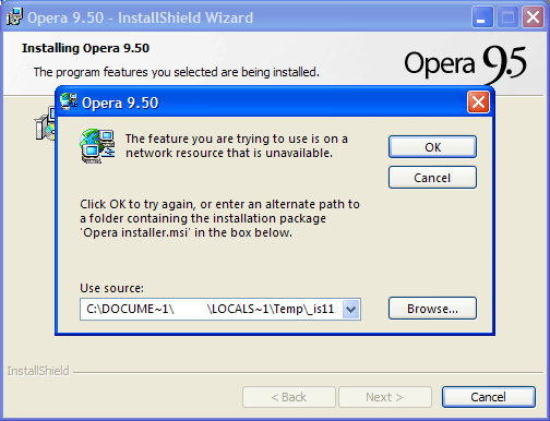
> Problematic Windows Installer…
Wilhelm,
You are right. I’ve read only their latest post for the “known issues” so thought it’s just how skin looks.
The “new tab” button is now a toolbar on it’s own, rightclick -> customize -> panel placement “Off” and it’s gone.
I much prefer this consistent theme with same-coloured icons than the rainbow mess that the previous skin was. There’s still a few issues with inconsistent height across elements (see fields with dropdowns for example) and vertical alignment (see trash top-right) and I feel both address- and tab-bar could use some trimming to their padding.
All in all, I much prefer this new skin over the old technicolor horror.
hi!
i like this skin….but i am not able to do search within web page…..can anyone tell, where van i find this option?
Thankx
Smax
Hmm, I’ve switched to Firefox 3 for my main browser on my main computer(Opera remains on older computers, Firefox 3 is too heavy.)
Probably going to install this and test it. I guess it will fit well in with Vista(and KDE 4 pherhaps), but personally I’m not sure if it’s all that better than the former Opera default skin. That skin was perfect. No fancy shit, but functional and helpful. (And it even looked good in GNOME since it have the same colors as the default theme.)
Anyway, I’ll try it when I get home. :)
Let us know what you think about it, TLZ
By the way, new skin looks much better with icon size set to 90% rather than 100%
the skin looks cool, but what I don’t like is the tab height, just a waste of space..
it’s out of beta now and most of these issues has been daily fixed in their beta releases .
What I want to know is, how do I change back to the way it used to look? That is all I want to do. Does anyone know how?
does anyone know how to change the skin back to one like the old one? Id much prefer that than this one.
Yes, click find more skins when entering customize > skins, there should be a classic one uploaded
“Just a small tip here: make the following button removable. CTRL+T works fine here.”
you can.
right-click on it, then “remove from toolbar”
Mike,
You are right. With Opera 9.5 Final now possible to do that, but the build which I used (10051) didn’t had this feature yet :-)
I’m just wondering: what’s the point of this article?
Isn’t a review supposed to shed light on the down- *and* upsides? All I’ve read is nagging about mostly minuscule glitches in a short-lived beta.
Similarly, I don’t get the point of having a newbie user try out a beta. It’s called a beta simply because it isn’t ready for general usage yet. A beta does not have to live up to the standards of a final version, yet it’s treated like it should.
Since Opera team is reading this blog, the point of this article is to provide them a feedback so they can consider if those “bad” things are worth changing.
Can anyone help me, the icons(little picture) in the tabs are too small how can i enlarge them? I use them a lot to help me navigate and now when i open 20+ tabs they are barely visible.
Well after around 5minutes of this new skin it made me load the old 9.0 skin from their site.
Luckily Opera is highly customable, so presing “Tools(menu)->Appearance…->Find more skins” will give you a gazilion skins at your disposal. So setting 9.5 skin to the 9.0 is very easy.
Hope that helps.
jostko wrote:
“Can anyone help me, the icons(little picture) in the tabs are too small how can i enlarge them? I use them a lot to help me navigate and now when i open 20+ tabs they are barely visible.”
Hey, this is EXACTLY my own complaint with the new opera version 9.5!
And btw., even using all kinds of classic skins with 9.5 doesn’t bring back the old tabs and the old icon size inside these tabs.
I wonder why not more people talk about this:
The new icons inside the tabs (the icons for web sites, I mean) are so small and don’t fill the available space within a tab, they are hardly noticeable – This behaviour does not happen when using the Linux version of Opera 9.5! But with windows, yes, unfortunately…
I am very disappointed by this new tabs/icon tabs behaviour…. :-(
This is what I mean (most likely jostko, too) by “icons in the tabs”; they are so small as compared to before opera 9.50:
Just have a look (opera 9.50 versus 9.02, same number and kind of open tabs):
Though the tabs below (in the second picture) are even smaller (less height than with 9.50) the icons inside each tab are much clearer, bigger, better to recognize and distinguish:
h**p://www.ld-host.de/show/0d0682d37057e1d4afd8aa2e3f8ccab6.png
Regards, juuraa
Like many more people (I believe, a VAST majority), I did not like the new skin of version 9.5.
The Opera team should offer users the possibility to keep the EXACT (with square tabs, not rounded ones) Classic Skin, for all those who liked it since the beginning.
The Opera browser has always been much more elegant than ALL the other ones. It is not necessary to imitate them at all. Opera belongs to a class of its own.
so many bugs…
last night my o9.5 went crash!
damn!!!
i miss the simplicity of o9.27…
i luv improvement of the skin though…
*why do they call this ‘FinalVer.’ anyway???
firefox3 <<>> opera9.5
I have just installed the 9.5. I find it ok…and I find it sobering that the close button dissapears after 17 tabs. One needs temperance you know. And thinking about it…it’s not that much of a hassle, because anyway when I had like 50 tabs open, I would get lost between them and this is an incentive to raise “browsing awareness” :)).
Laurentiu,
Yes, this is annoying. Try http://my.opera.com/desktopteam/blog/2008/06/25/opera-9-51-rc-1
:-)
I just wonder if the feeling on the skin is different now as the browser has been out there for a while, because since 2000 I have designed a new skin on each release for opera and this time around I were really happy as in earlier times, but the feedback are this time around better, believe me, there have been death threats to me over the last 8 years due to design changes from one version to another. Nothing like this this time around with my 95 design. And my feeling is this that the most active users will complain and also give pros on new design, but in the start most think change is bad. After a short while most find the new skins and logics better than the last version, because when a new version is released there are always thoughts on how much better the old design were.
Yours PAL
The new dark skin (as of Opera versions above 9.27) is not usable. It degrades the UI effectiveness immeasurably. When you want to quickly find the right button or menu item you must glare at a dark muck of lots of black icons which all look the same (when you compare them to nice crisp and different looking icons from the 9.27 windows native skin).
I’ve used the 3 browsers IE, FF and Opera for many years. When I got to Opera 9.27 I almost never used the other browsers anymore. But when I upgraded to a higher version of Opera I almost got a stroke and nearly died. I was faced with a hard decision: Stick with Opera 9.27 which has security issues/bugs, or upgrade and get some user-build skin which resembles the 9.27 windows native skin, but will probably have lots of issues.
Well all the user build skins which look like 9.27 have issues, so I ended up continuing using Opera v9.27, unsafe and with all security risks and all.
Oh yeah your dark skin. You know what I think, its dark, its unreadable, its ugly, its not usable, its annoying, it looks unsafe, it is utterly horrible.
So stop playing around with creating skins for the sake of creating “A New Skin”, and start investigating what the user base thinks about the skins first. And exclude any people from that user-base who make skins themselves because they cannot be taken for users who use Opera for real, efficient, business like use.
Hi.
The new dark skin (as of Opera versions above 9.27) is not usable. It degrades the UI effectiveness immeasurably. When you want to quickly find the right button or menu item you must glare at a dark muck of lots of black icons which all look the same (when you compare them to the nice crisp and different looking icons from the 9.27 windows native skin).
I’ve used the 3 browsers IE, FF and Opera for many years. When I got to Opera 9.27 I almost never used the other browsers anymore. But when I upgraded to a higher version of Opera I almost got a stroke and nearly died. I was faced with a hard decision: Stick with Opera 9.27 which has security issues/bugs, or upgrade and get some user-build skin which resembles the 9.27 windows native skin, but will probably have lots of issues.
Well I rather use an old insecure Opera version with a normal colorfull interface, then one with that dark muck in it where it takes ages for one to find the icon you are looking for.
I think you have to stop asking advice from anyone who is into skin-building themselves. Those people love lots of thinks and look at a skin in a completely different way than normal users.
So I have one tip for you to measure your skin’s quality: Go to someone who has never used Opera, or someone who has always stuck to 1 Opera skin, and messure the time it takes him to perform certain actions for which he has to search for certain icons in your skin.
Bye
Hi.
Let me enlighten you about your assumption that: After a short while most find the new skins and logics better than the last version.
NO, they just get used to it, and might accept the performance loss in usability or just stop using Opera altogether, or stick with another version and give up hope.
Icons in a skin are used to find certain things as quickly as possible.
Lots of people might find your skin really nice when looking at it like an artist looking at a painting. But an User Interface should not be looked upon as a painting. The most important thing is how quickly one can distinguish different icons and click on the right one.
So yes your skin is really nice, but you must be really out of your mind to think that a skin in which all icons are looking black is more usable than a skin with nice different looking colorfull icons.
Bye.
Sorry and please remove my comment from: (Mr Browse on April 2nd, 2009 9:09 am)
I accidentally posted it. I think it was a bit too harsh and not ment to be posted.
Sorry,
Bye.