Microsoft Made A New Font For IE11’s Reading View
 Today, Microsoft has published an article about Internet Explorer’s reading mode, which, just as you might expect, focuses on the required content delivery and its readability.
In order to achieve that, the software giant has designed a new font called Sitka and according to Microsoft, it’s “the first typeface family designed with scientific legibility studies integrated directly into the design process”.
Furthermore, you can forget about clicking on the “Next Page” links as they have been eliminated, all you have to do when Reading View mode is on (CTRL+SHIFT+R) is keep scrolling,
Here’s how a web page will look like once the Reading View is enabled:
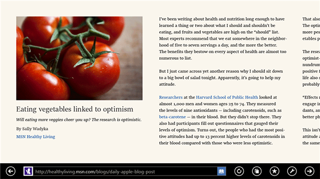
Nice and clean, just as you would expect.
For even more details, head over to the original post.
[Via: Neowin]
About (Author Profile)
Vygantas is a former web designer whose projects are used by companies such as AMD, NVIDIA and departed Westood Studios. Being passionate about software, Vygantas began his journalism career back in 2007 when he founded FavBrowser.com. Having said that, he is also an adrenaline junkie who enjoys good books, fitness activities and Forex trading.
Subscribe
If you enjoyed this article, subscribe to receive more just like it.


Nice and clean indeed.
How about Helvetica designed in 1956 plenty of research has gone into fonts from way back.
http://en.wikipedia.org/wiki/Helvetica
Its a waste of time making it easier to read, research carried out in 2012 says the less legible the font the better the recall.
http://hbr.org/2012/03/hard-to-read-fonts-promote-better-recall/ar/1