Firefox Add-Ons Page Upcoming Design (Review)
 It looks like Mozilla team is making more changes before the upcoming Firefox 3 release. This time they are working on new addons.mozilla.org web page design. While it’s still under development, I’ve found pretty much things which I didn’t like at all. Since I’m designer myself, here are the things which I didn’t like:
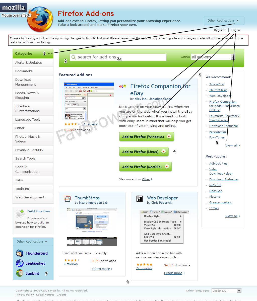
Click on the Picture to Enlarge.
1.Small arrow makes it look like this menu can be expandable (same as the one in the right). However, it isn’t (confuses users).
2. Way too big object, colors doesn’t match with the “background color” (blue one) as well.
2a. Too big font.
3.Tables are not at the same line (looks unbalanced).
4. Buttons should be: from the biggest to the smallest one (so they would fit to each other) or all at the same size.
5. Links are underlined there. However, in the top they are not (confuses user, too many links styles used, some looks like a plain text).
6. Tables are not at the same line. Maybe “read more…” for the “Web Developer” plugin would help. This would reduce text and make table look like the one in the left.
7. This one is actually an expandable menu (see “Other Applications” in the top). Bad background color.
Since it’s still under the development, I don’t want to get into any more details, like: “colors don’t match at“all or so. Waiting for the final version…
Check upcoming addons.mozilla.org design page.
Please note: this is only my opinion which may differ from yours.
What do you think about it?
News and Reviews about Your Favorite Web Browser. Subscribe to our RSS Feed.
About (Author Profile)
Vygantas is a former web designer whose projects are used by companies such as AMD, NVIDIA and departed Westood Studios. Being passionate about software, Vygantas began his journalism career back in 2007 when he founded FavBrowser.com. Having said that, he is also an adrenaline junkie who enjoys good books, fitness activities and Forex trading.
Subscribe
If you enjoyed this article, subscribe to receive more just like it.


Comments (4)
Trackback URL | Comments RSS Feed
Sites That Link to this Post
- 2 Mozilla Firefox Design Mistakes? | February 27, 2008
- New Firefox Add-Ons Page Design | March 27, 2008
I agree. The colors totally clash at some points, and the links should be kept to the a = no decoration, a:hover = with text decoration, which seems to have become a standard on the internet. The buttons could be merged into one, with little images for microsoft/osx/linux, to save space and to make it look less clunky. The colors could be orange instead of that green (that seems to have nothing to do with the rest), and if the tables are staying like that, they should lose the borders entirely, or make them less visible.
Well, now the little arrows do expand, but I still wouldn’t try to rate the design yet, as this seems to be a playground for the codemonkeys who want to test their evaluation system not the designers.